Antoine Pêcheux

Antoine Pêcheux

Product designer, then Head of Product, and still the one who designs the screens. Twelve product lines, thirty-two live sites, one design system, payment flows under regulation, and the shared brain the company and its agents think with.

Malta · English / French

32
live sites, 12 product lines
36
products in one shared brain
9
legal entities, one baseline
10+ yrs
in product, designer first

Management

design and dev teams

Nine legal entities, development teams split between them, and a new site launching every few weeks. Nobody had the full picture, so I ended up being the one who did. I talk to the founders and to every technical team, and I built the team's knowledge base so the context stops depending on whether I am available.

  • Direct line to the founders

    I sit between the founders and the technical teams. Decisions come down through me, and what is actually happening on the ground goes back up.

  • The team's second brain

    A knowledge base wired to agents, designed and deployed by me. It holds project state, standards and past decisions, drafts the PRDs, and the team reads it without going through me.

  • Tools and rituals

    Weekly design reviews, per-product syncs, internal tooling. When something stops circulating between two teams, I set up the meeting or the tool that gets it moving again.

  • Hiring and follow-up

    Sourcing, interviews, judging fit, and the follow-up once someone has actually started.

  • Difficult decisions

    Some of the calls are about people rather than planning. I have had to make those too.

  • Roadmap, standards, delivery

    Per-site prioritisation, one shared UX baseline, QA and sign-off before every release.

10+ yrs
in product

Designer, then Head of Design, then Head of Product, over three years.

Shared brain

Designed, built and run by me · Horizon Web, 2026

Horizon Context, the memory a company and its agents think with

  • Knowledge architecture
  • AI agents
  • Trust boundary
  • Information design

Thirty-six sites across nine companies, and the knowledge spread over emails, slides, Figma comments and people's heads. I designed the shared brain that replaced that: one memory, read by the team and by the agents, with a trust boundary checked on every change so an AI can never leak what it should not know.

No fact without a source. When sources disagree, the agent writes both and a person decides. Tested blind: sixteen answers out of seventeen right, zero false, then reviewed line by line by the CEO and the CTO.
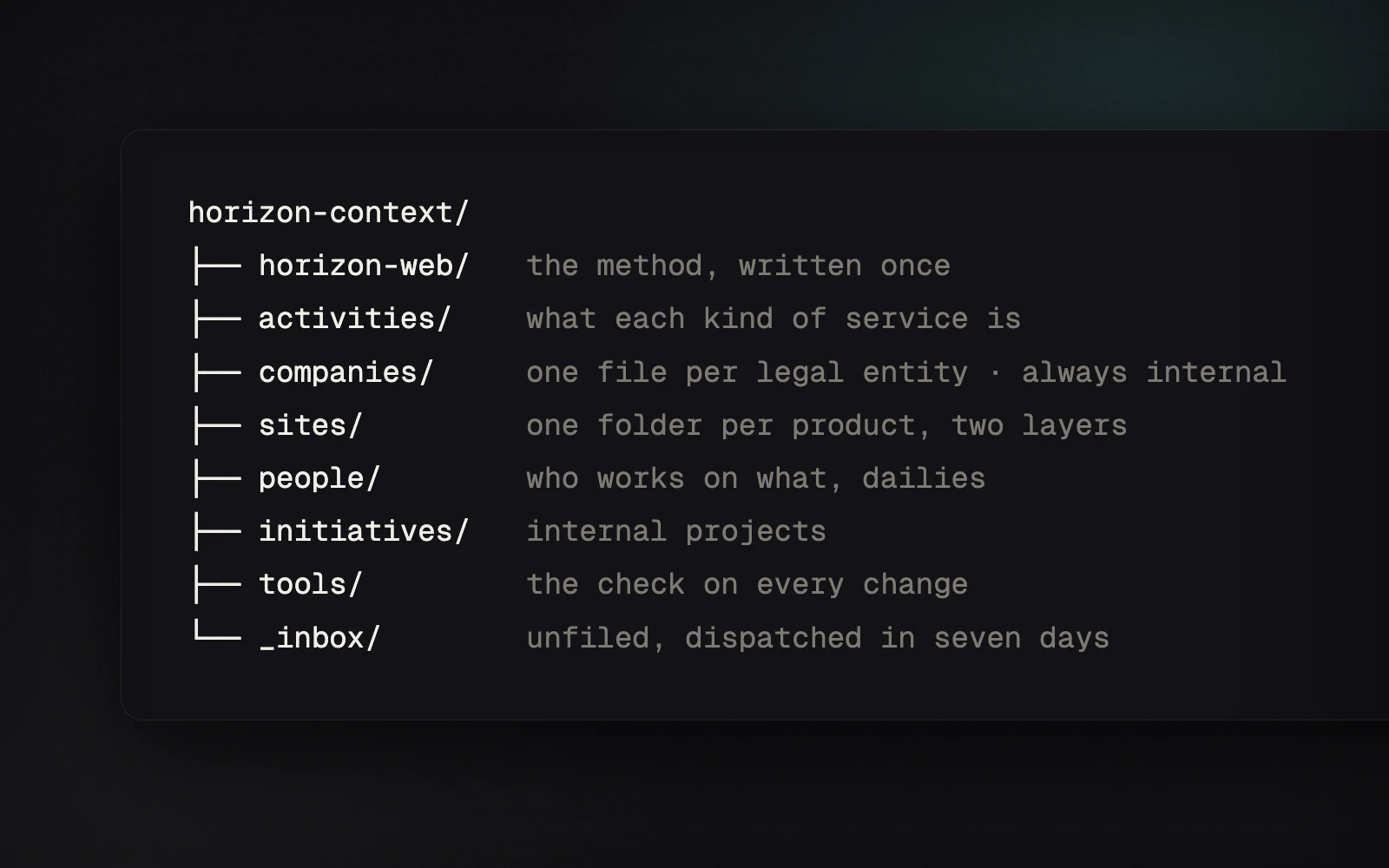
The shape of the shared memory
36
products in one shared brain

Read by people and by agents, without going through me.
Read the case study →

Data-dense product

Product and design lead, with the team · Horizon Web

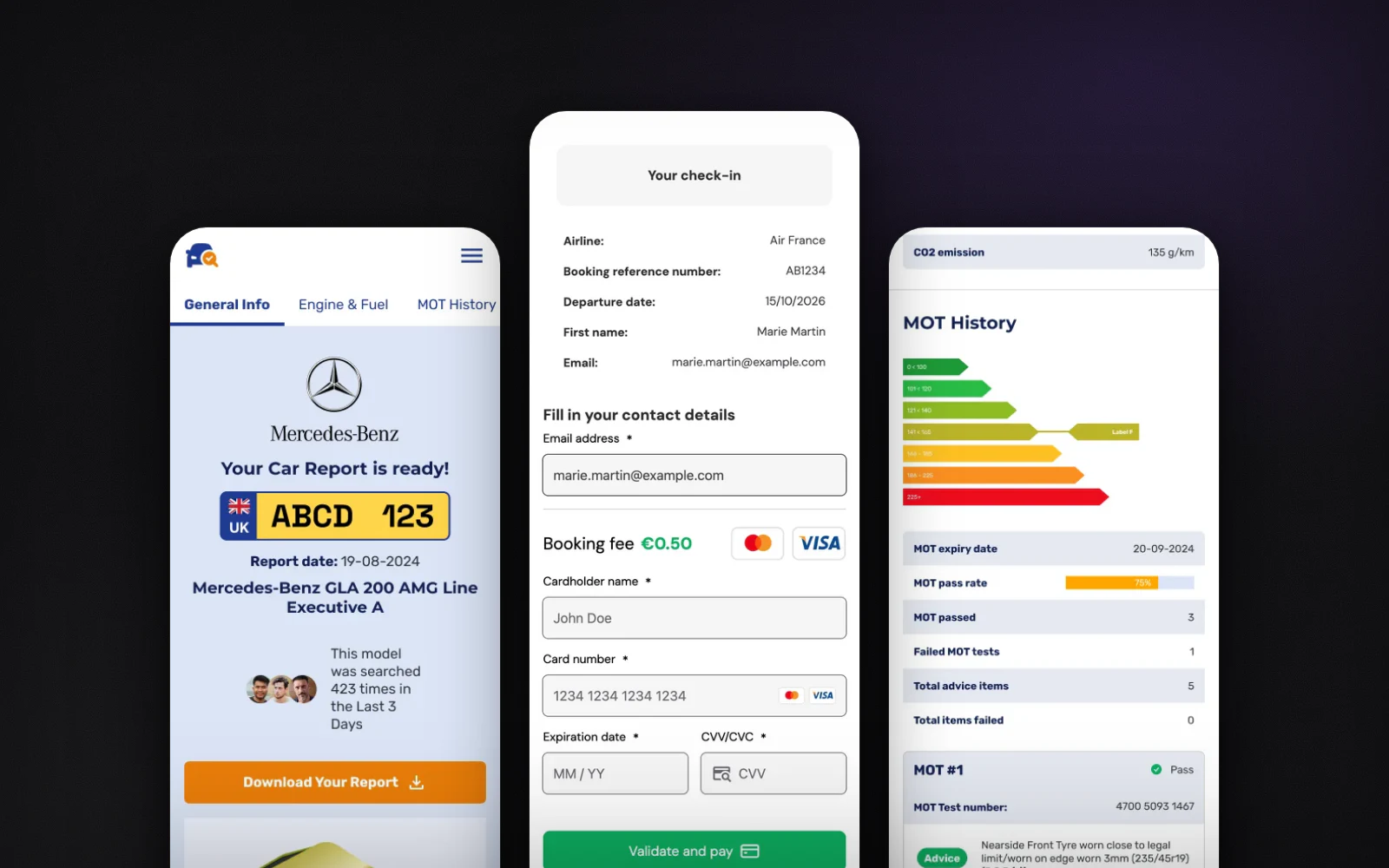
Carcheck Verify: fourteen sections of data, read on a phone

  • Data-dense UI
  • Tables and timelines
  • Triage patterns
  • Mobile first

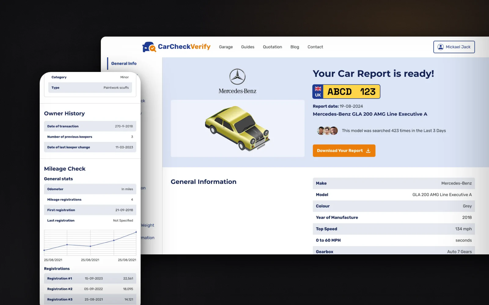
Someone about to buy a used car enters a plate and gets everything the registers know about it. Fourteen sections from five sources, read in a hurry by someone who is not a mechanic. One key and value table per section, status as chips before sentences, a mileage curve with its readings table underneath, and the same report on a phone with nothing hidden behind a tap.

The Carcheck Verify report on desktop, and the mileage check on mobile
14
sections, one shape learned once

Designed for the phone first, where most people read it.

Read the case study →

Design system

Designed in Figma by me, shipped as a package by engineering · 2023 to now

The Core: one design system, thirty-two live sites

  • Design systems
  • Design tokens
  • Component library
  • Governance

The group launches consumer sites at a high tempo. Before the system, every new site rebuilt the same pieces, and a bug fixed in one place survived in five others. I designed The Core in Figma: tokens and components with their variants and states, one set of foundations with a skin per brand. The engineering team built the npm package from it, and every new site is assembled from that package. I decide what enters the shared layer and what stays local to a brand.

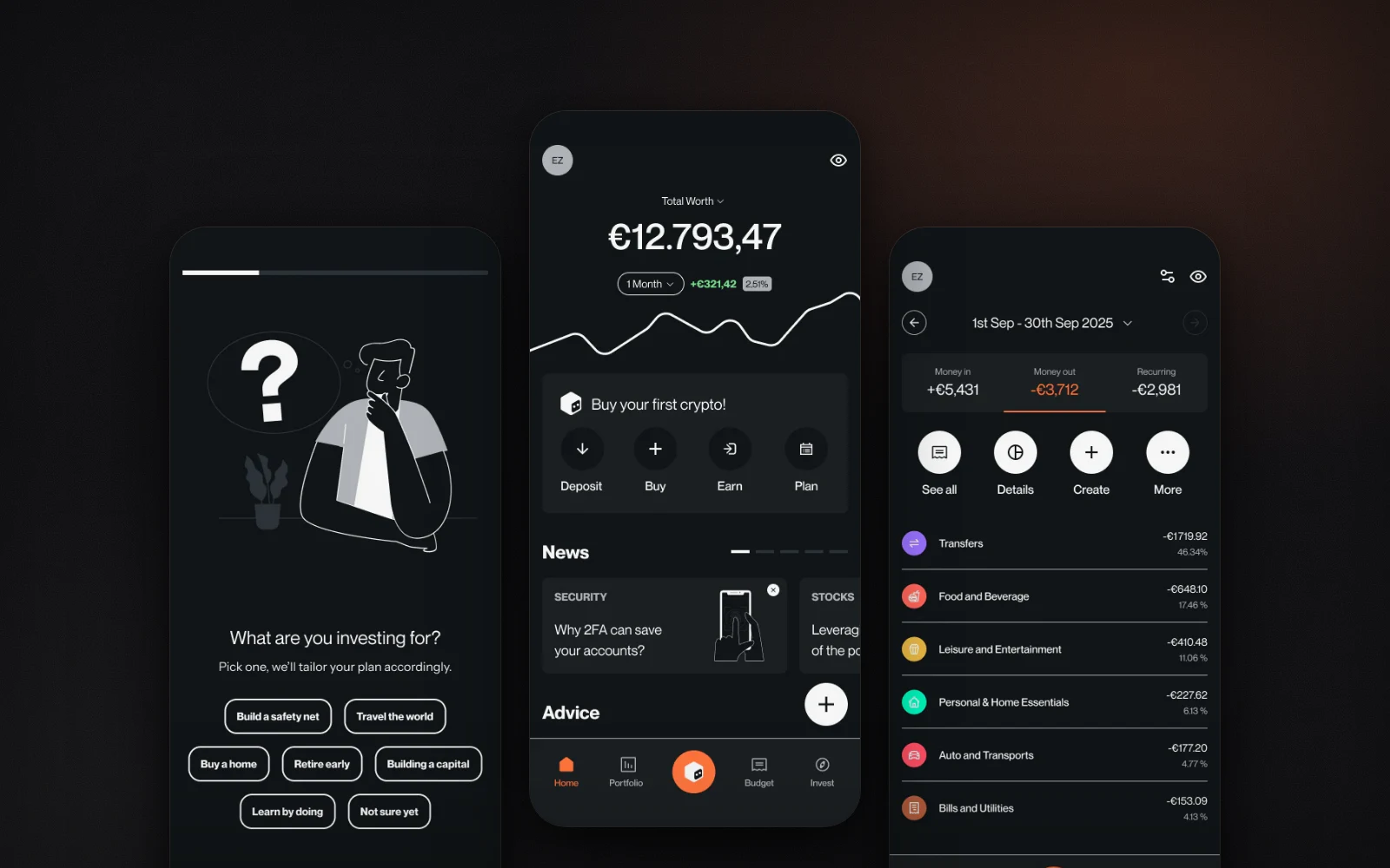
Three mobile screens from two of the group's products
32
live sites · 12 product lines

One fix, one release, every brand on the system.

Read the case study →

Payments

Accor, Idean for LCL, Horizon Web · 2020 to now

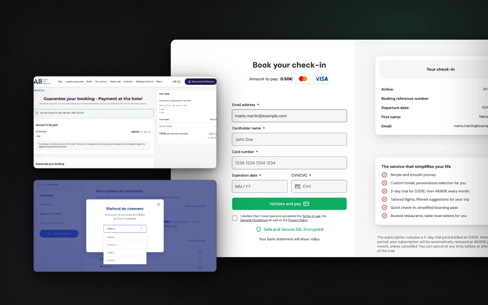
Payment journeys under PSD2, from a hotel group to twelve product lines

  • PSD2 / 3DS
  • Checkout UX
  • Subscription flows
  • Regulated markets

At Accor I owned booking and payment on web and app, with 3DS journeys under PSD2 across international markets. At Idean I designed core banking features for LCL, where clarity and microcopy are the security layer. At Horizon Web I own checkout and subscription across twelve product lines, with three payment providers, and the standard every payment page follows: one amount said once, cancellation in plain words, every error state designed.

Payment screens for Accor, LCL and one of the group's subscription products
3
payment providers · one standard

Under card scheme, PSD2 and consumer law constraints.

Read the case study →

AI in production

Designed and built by me · Horizon Web

Agents that review every site before launch

  • AI agents
  • Compliance
  • Accessibility
  • Output contract

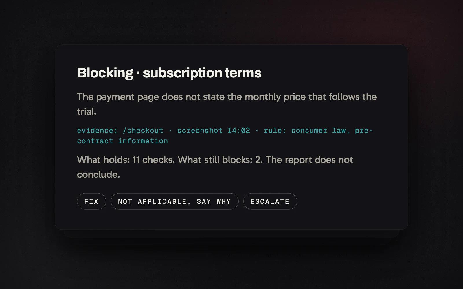
Before a site goes live and reaches a payment provider, it passes a review on four rule sets: accessibility, consumer law, cookie consent, card scheme rules. I designed and built the agents that run it. The design work was the output contract: every finding cites its evidence, nothing unverifiable passes, a missing fact comes back as blocking, and the report counts what holds and what still blocks instead of declaring compliance.

A finding, as the review agents write it
4
rule sets, on every launch

Findings people can check, so they act on them.

Read the case study →

Agent systems

Designed and built alone · my own server

A second brain with agents, running unattended since April 2026

  • AI agents
  • Human in the loop
  • Provenance
  • Automation

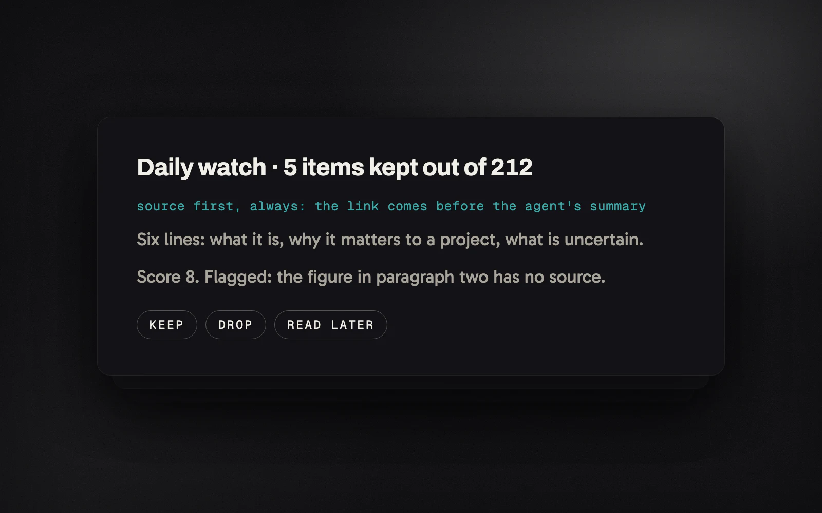
A knowledge base of eight hundred notes, wired to agents that run on schedule. Six are live today. The design problem was probabilistic output: source before summary, a decision with no free text, a button that is also the record, and a health check that shouts when an agent goes quiet, because silent success is the enemy.

The decision card of an agent
6
agents live, unattended

Running since April 2026, whether I show up or not.

Read the case study →

Game and image pipeline

Co-created · Godot 4.4, a LoRA I trained, Recraft, Seedance

Brainrot Arena, and the pipeline that keeps three hundred characters consistent

  • Game design
  • Godot
  • Generative pipeline
  • AI video

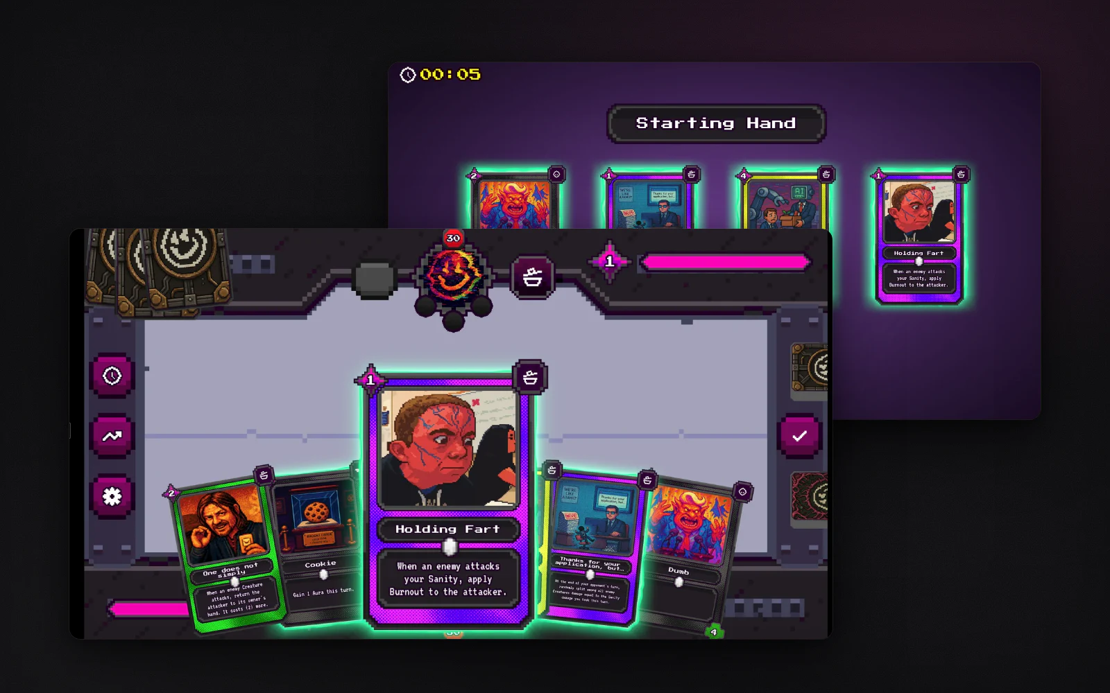
A collectible card game about internet culture: around three hundred character cards, a duel engine in Godot, a playable build. I co-design the systems, the interface and the art direction, and I built the generative pipeline that gives the whole cast one style: a style bible as a prompt, a LoRA trained on three hundred curated images, and a video pipeline that animated a three-minute sequence shot by shot.

A duel and the starting hand in Brainrot Arena
300
characters, one art direction

Playable today. Every image logged with its prompt and seed.

Read the case study →

Data product

Designed and built alone, live · Next.js, n8n, Stripe

Quitter France: a matching engine over a hundred-plus facts per country

  • Data visualisation
  • Tables and maps
  • Generated reports
  • Built alone

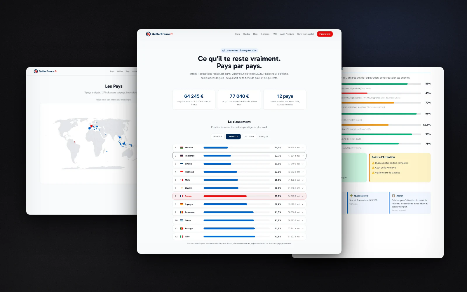
A questionnaire, a matching engine over around 127 verified facts per country across eleven axes, a ranking, country pages with indicators and comparison tables, a map, and a generated audit report with a seven-axis analysis, tax tables and a phased roadmap. Designed and built end to end, so the tradeoffs are mine to walk through.

The tax barometer of Quitter France, with the country index and a page of the audit report
127
facts per country · 14 countries

Dense data, legible to someone who is not an analyst.

Read the case study →

Concept studies

Self-initiated, designed end to end in Figma: a business bank account, a crypto wallet, a first investment.

Regulated onboarding

Concept study, self-initiated · Figma, desktop and mobile · 2025

Ascendia: opening a business bank account, one question per screen

  • KYC and AML
  • Business onboarding
  • Strong authentication
  • Dark and light

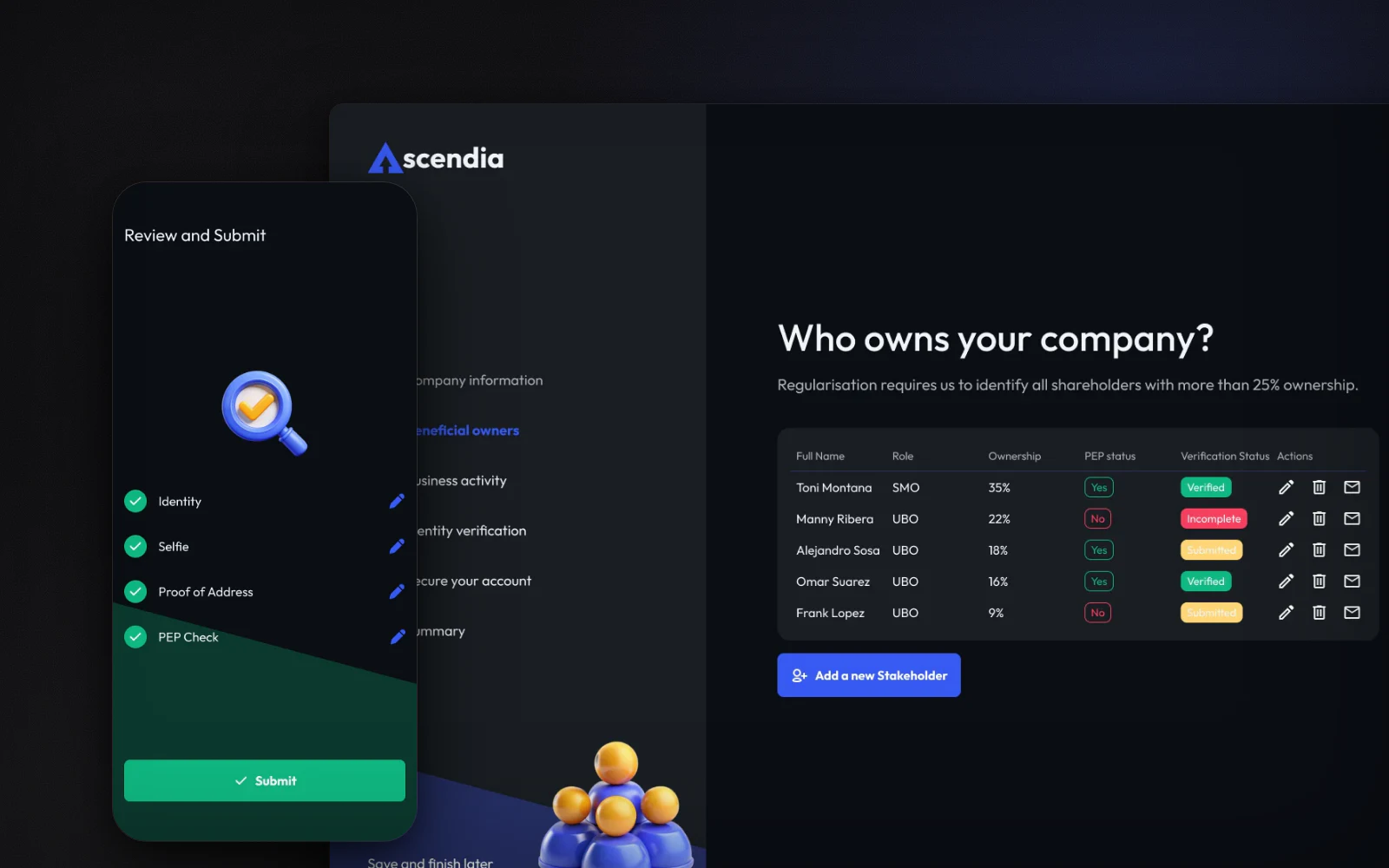
A concept study of opening a business bank account in Europe, where the founder has to prove who owns the company and where its money comes from. Five steps and a summary, one question per screen, and every regulatory request explained in one plain sentence on the screen that makes it. The owners table shows where each person's verification stands, the identity check is designed for the phone, and every screen exists in dark and light.

The Ascendia owners table on desktop, and the review screen on mobile
6
steps, one question per screen

Each rule is explained on the screen that applies it.

Read the case study →

Crypto wallet

Concept study, self-initiated · Figma, mobile · 2025

VaultLink: one portfolio across crypto wallets, and the two screens where trust is decided

  • Web3
  • Wallet connection
  • Permissions
  • Mobile

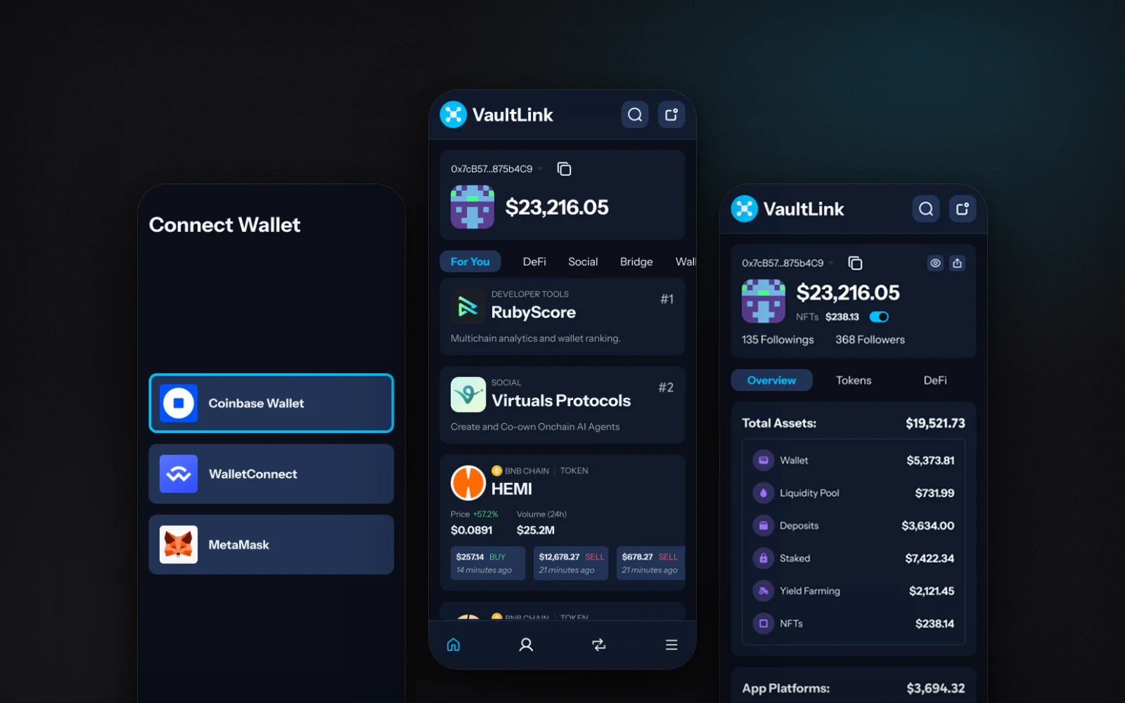
Crypto holders often spread their money across several wallets and blockchains, so checking what they own means one app per wallet. VaultLink is a concept for a mobile app that puts it all in one portfolio. The design work went to the two moments where trust is decided: connecting a wallet, and granting permissions, here two of them, one line each. Three questions then set the feed, and the portfolio groups assets by what they do.

Three VaultLink screens: connecting a wallet, the feed, the portfolio
2
permissions, one line each

Both shown in full before anything is accepted, with Cancel right next to Continue.

Read the case study →

Investing for beginners

Concept study, self-initiated · Figma, mobile · 2025

Nestly: an investing app for people who think investing is not for them

  • Fintech
  • Onboarding
  • AI assistant
  • Data on mobile

Most investing apps open on charts, which tells a beginner the app is not for them. Nestly is a concept for a mobile app that starts with three questions: what the money is for, how much each month, how much experience. An assistant answers in plain words and can be turned down. A summary repeats the answers before anything is invested, then each tab answers one question: how much, where, where it went, what next.

Three Nestly screens: the goal question, the home tab, the budget
3
questions before the first chart

The plan is one the person agreed to.

Read the case study →

Skills

design, product, AI

designproductaidesign systemsfigma at scaleaccessibilitypayments · psd2/3dsfunnels & crosuccess metricsprds · roadmapsmixpanel · kpisagents in prodn8n · automationprompt architecture
  • Design: design systems, Figma at scale, accessibility
  • Product: roadmaps and success metrics, funnels, Mixpanel, delivery with engineering
  • Design × Product: payments, PSD2 and 3DS
  • AI: agents in production, n8n automation, prompt architecture

Education

design, then code, then product

  • Product SchoolProduct Manager Certification2024
  • Le WagonWeb development bootcamp2021
  • IESA MultimédiaMaster's degree, UX design2017 → 2019
  • École MultimédiaGraphic and web design2013 → 2014
Download the CV